BYOMA Rebrand
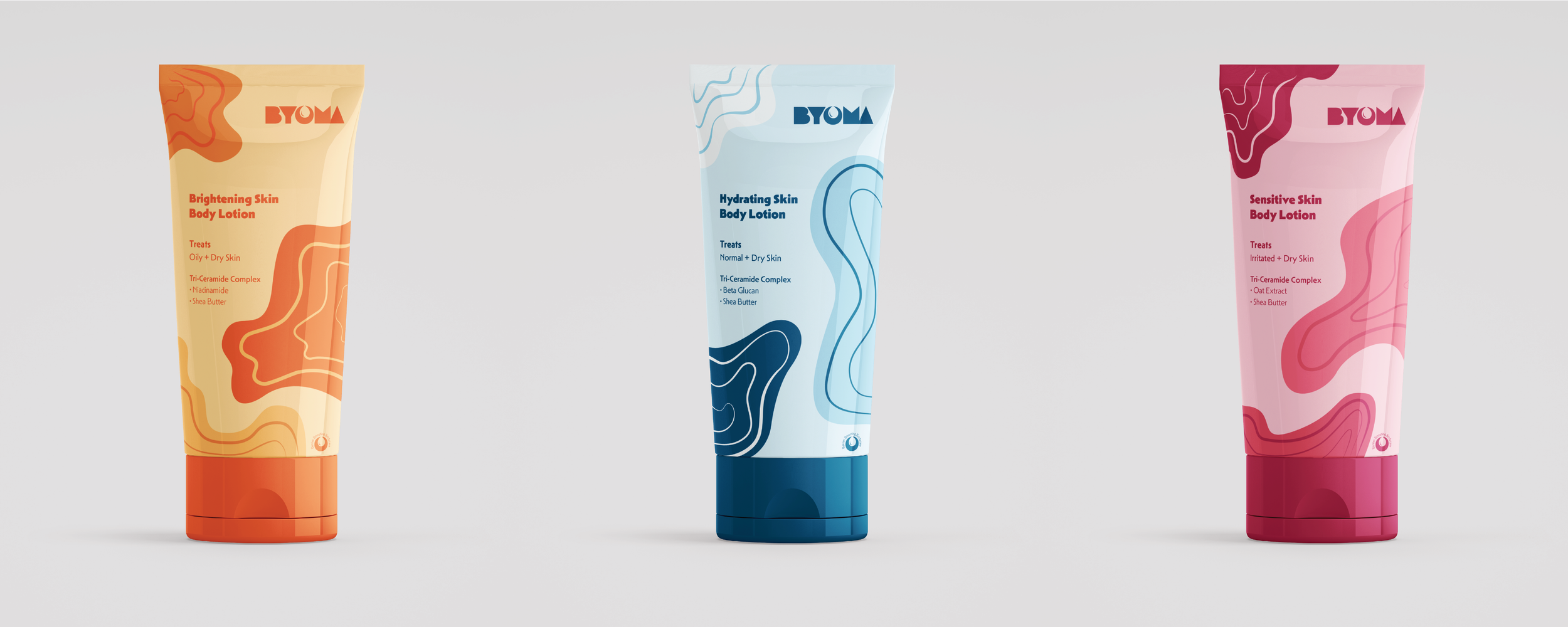
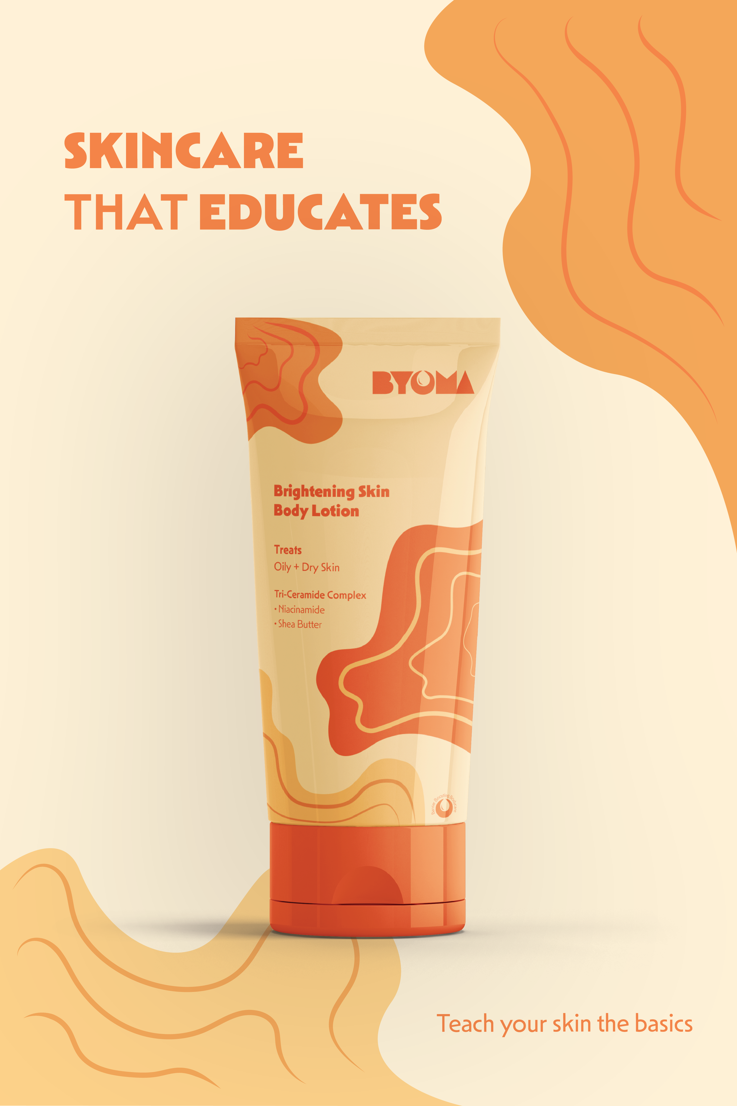
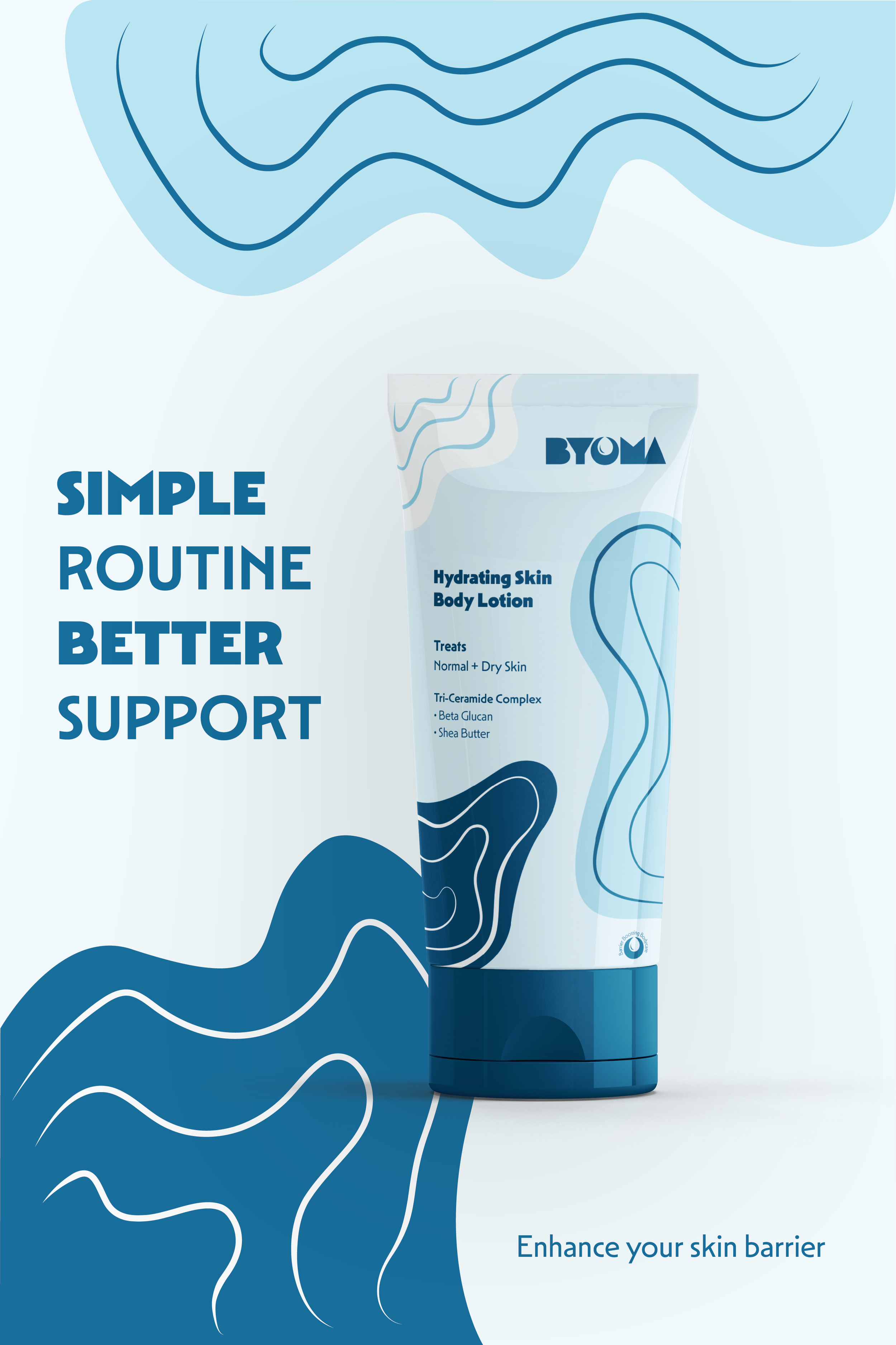
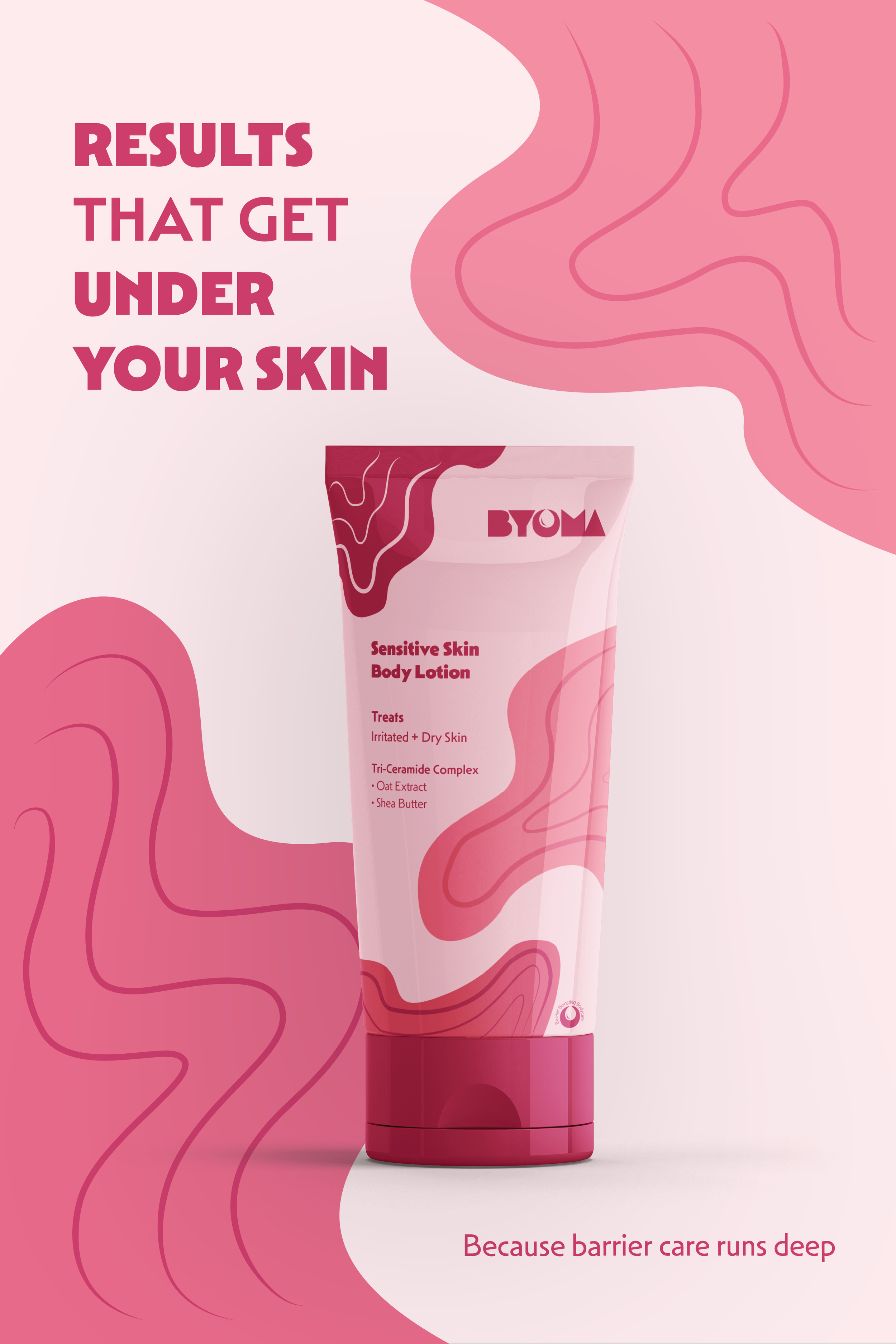
For this popular skincare rebrand, I explored a new design approach to make the BYOMA brand identity more appealing and visually dynamic while sticking to the modern aesthetic. Since the original logo was more modern, I decided to incorporate this approach to keep the message of the brand. I thought the packaging design lacked intentionality of “barrier boosting skincare” that this brand was marketing. In order to get this message across, I added movement through color and organic shapes to communicate the idea of building a better skin barrier while maintaining a similar minimalistic approach. The BYOMA ads were designed with the idea of what makes BYOMA the best skincare on the market and what appeals to the target audience.