
RE-design: BibleGateway
This project objective was to expanded design-related concepts applied to a series of problems that are found in interaction design. It involved redesigning the home page and additional pages of a widely-used website with a focus on making the site more user-friendly. After extensive research by visiting the chosen site and spending time navigating through its pages, I was able to identify many issues with the usability of the website. Using Adobe XD, I corrected these issues by creating a new and improved prototype.
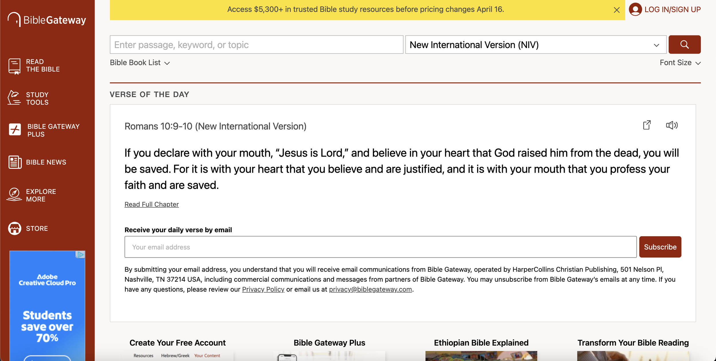
Original Website Home Page
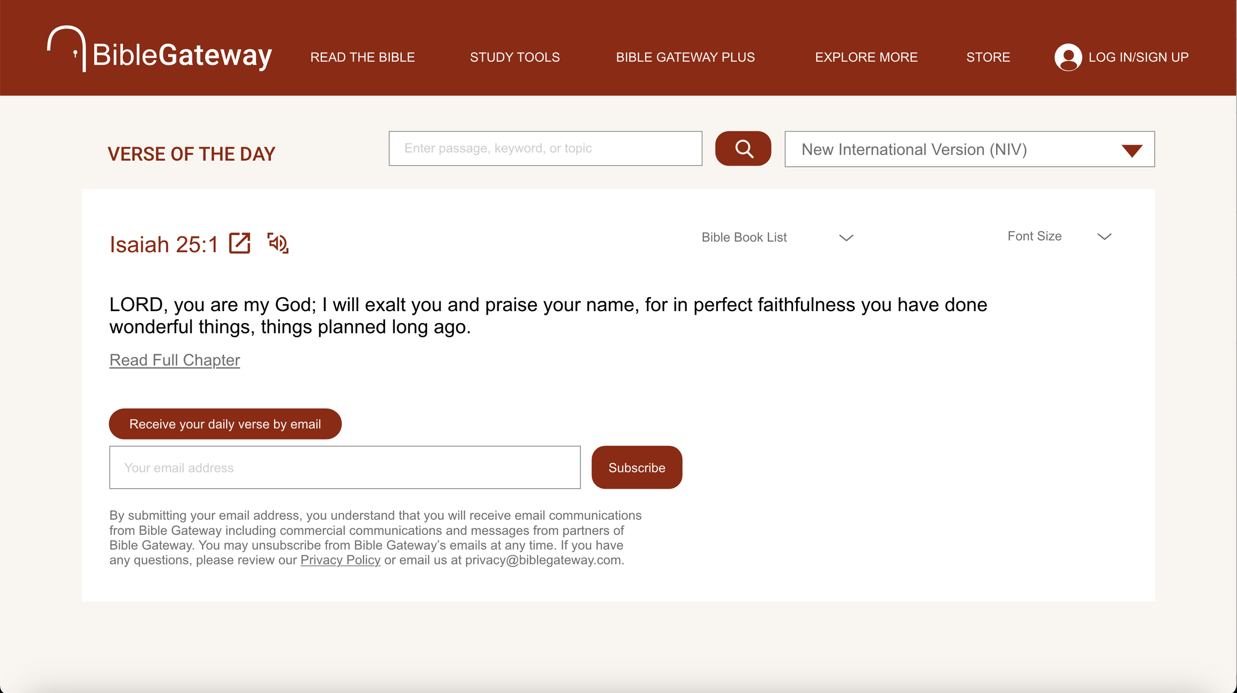
Prototype Home Page
Donald Norman’s Fundamentals of User Experience
Conceptual Models: The BibleGateway website is all about inviting users to explore the Bible. The different navigation tabs on the sidebar and the bottom of the page contain content that allow the user to understand more about the Bible and what it contains.
Discoverability: Drawing more attention to the homepage by giving it a modern look, improving visual hierarchy and enhancing key features will help influence user interaction to continue exploring the content of the website.
Affordance: Since the homepage is the first thing users encounter, elements such as typography, hierarchy, color, and organization are all elements that work together to engage the user to want to interact with the content.
Signifiers: Guiding the user around the website without having repetitive and disorganized elements will help users to identify interactive components. This further allows them to understand how to navigate the site efficiently.
Mapping: The controls in this case refer to the buttons that users click to navigate to different sections of the website. The effect is how these interactions lead to smooth transitions between pages and the user’s first impression of the page. Key questions to ask: Does the user want to continue reading? How is the layout of content being perceived? The new interactive prototype does influence the user to want to return to the site.
Constraints: The homepage will feature all available pages, allowing users to easily navigate the website. However, other pages will include fewer repeated navigation elements to avoid overwhelming the user. Reducing the amount of repeated information across pages creates a cleaner layout and improves the user experience by making content easier to focus on and explore.
Feedback: Responses from user testing indicates that the updated layout improves the overall website design because there is a more cohesive flow of visual elements. This is more appealing for users to engage with the content of the website and the navigation.
Seven Stages of Action
Plan: BibleGateway will have an updated layout design keeping the same information but formatted using better typography, hierarchy, and organization. There will be an exploration of improved navigation that will guide the user to different pages of the website.
Specify: Determine what needs to be included on the homepage and what should be moved to other pages to simplify the amount of content that the user sees first. Narrow down what needs structure whether its the placement of content or spacial organization in order for the pages of the website to cohesively flow together for users to understand.
Perform: Update the design of the homepage and incorporate a similar design layout to all pages.
Perceive: Majority of user testing responses show a positive experience with the interface of the website design. Users stay engaged with the content because of the organization and structure on each page.
Interpret: The changes to the website give a better experience and is easier for the user to navigate to specific areas they are interested in or want to learn more about.
Compare: The task that I want the user to accomplish is to be able to easily navigate through the website and learn what BibleGateway offers in terms of guiding users to learn about the Bible.